
Donut Chart in Tableau
 Call 8585951111
In this article we will discuss one of the type of chart in tableau i.e. Donut Chart in Tableau with an example.

Introduction
In this article, we will discuss the Donut chart in the tableau.
Tableau is a data visualization tool that allows drawing different charts and graphs using Show me with just simple drag and drop.
Tableau Show Me has 24 different charts.
Each chart in the tableau corresponds to a minimum number of dimensions, measures, bins, etc.
Best-suited Tableau courses for you
Learn Tableau with these high-rated online courses

Table of Content
What is a Donut Chart?
Pie Chart is one of the best visualization tools to represent the proportion of the data but sometimes it is criticized for focusing readers on the proportional areas of the slice to one another and the situation became more problematic when comparing multiple pie charts at a time. To overcome this problem Donut Chart came into action.
A Donut Chart or Doughnut chart is a type of Pie chart with a hole at its center. It has a similar use to of Pie chart which is used to show the proportion of the categorical data with the size of each piece representing the proportion of each category.

To know more about Tableau, Click Here.
Example:
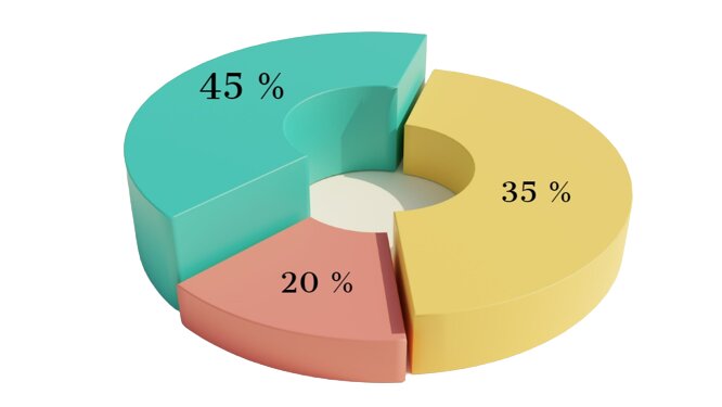
The Election Commission of India declared the data of different age groups of people participating in elections:
| Age Group (years) | Contribution(%) |
| 18 – 25 | 35 % |
| 25 – 55 | 20 % |
| 55 – 80 | 45 % |
Let’s understand how to create a Donut Chart in Tableau with an example

 Read Later

Steps to create a Donut Chart
We want to show category wise profit as well as total profit using a donut chart in Superstore Data.
- Connect a file (here, we will use Sample SuperStore data)
- Set up Base
- In row shelf write avg(0) two times (as mentioned in the screenshot)
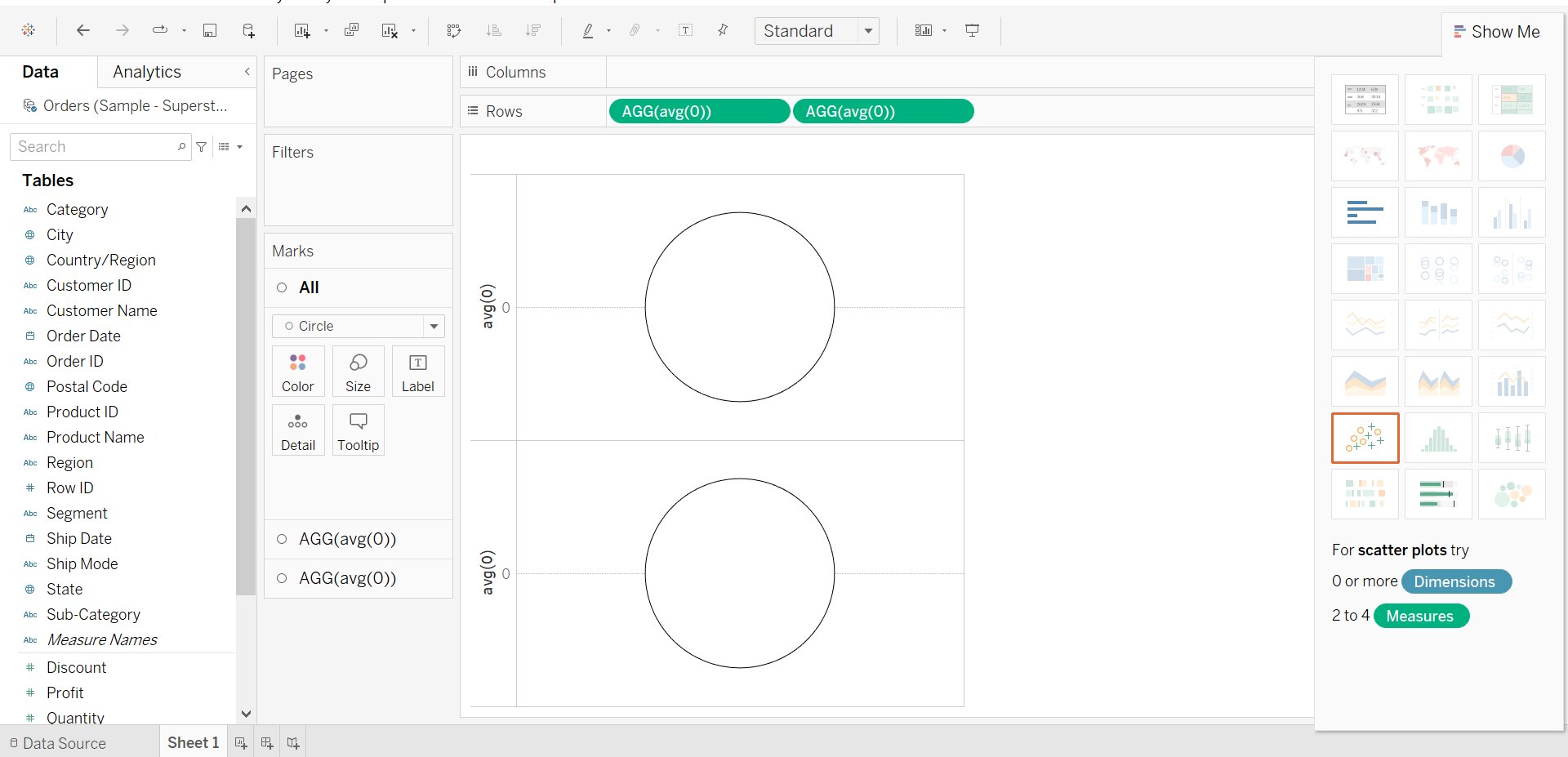
- In First AGG(avg(0)) in the Mark Pane:
- Select Pie Chart
- Drag and drop the Category into the Color and Profit into the Angle
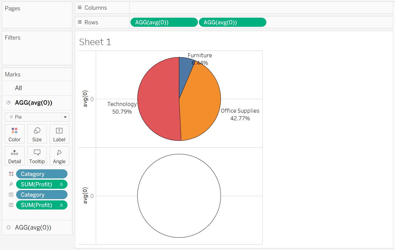
- Drag and drop Category and Profit into Label
- To convert the values into percentages
- Right-click SUM(Profit) -> Quick Table Calculation -> Percentage of Total
- To convert the values into percentages
- In Second AGG(avg(0) in the Mark Pane:
- Select Circle Chart
- Select White color under Color (This will create a hole for Donut chart)
- Drag and drop Profit into Label
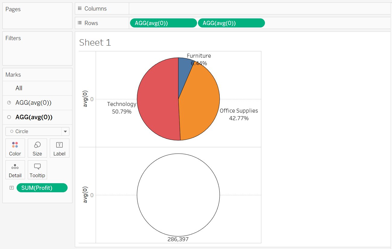
- Combining First and Second (Pie and Circle Chart)
- Right-click on the second AGG(avg(0)) in the row shelf
- Select Dual Axis
- Increase the size of the pie and circle chart using the size in the first and second AGG(avg(0)).
- We get the desired donut chart

Click Here: To know more about Top Tableau Online Course & Certification.


Conclusion
In this article, we have discussed the Donut Chart in Tableau with an example.
Hope this article will help you in your data/business analyst journey.
This article is a part of a complete tutorial on Tableau, focusing on Tableau certified data analysts and tableau desktop specialists.
Through a series of articles, we will cover all the topics in-depth with examples.
Top Trending Articles:
Data Analyst Interview Questions | Data Science Interview Questions | Machine Learning Applications | Big Data vs Machine Learning | Data Scientist vs Data Analyst | How to Become a Data Analyst | Data Science vs. Big Data vs. Data Analytics | What is Data Science | What is a Data Scientist | What is Data Analyst

Comments