

IELTS Writing Task 1, pie charts are a common task. Pie chart is circular statistical data divided into numerous proportions. You have to make a report summarising the data in at least 150 words. The examiner assesses your ability to identify and report key trends of the given question. For this reason, you have to pinpoint major features within the factual information to score a high band in the IELTS Writing section.
Common Questions Involve:
- Describing how proportions differ.
- Comparing data between multiple charts.
- Highlighting significant trends and contrasts.

Understanding the IELTS Pie Chart as a part of Writing Task 1
Written example below will help you understand how to structure your response. You should aim to write answer in a planned manner
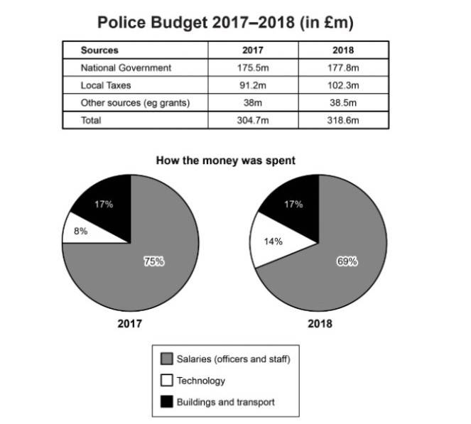
| The table and chart below give information on the police budget for 2017 and 2018 in one area of Britain. The table shows where the money came from and the charts show how it was distributed. Summarize the information by selecting and reporting the main features, and make comparisons where relevant. |
Source: Cambridge IELTS Practice Test Book
Pie Chart- Sample Response - 7.5 Band Score
The table presents the data on the police budget from which the money came, and the two pie charts describe the distribution of the amount of money in the consecutive years 2017 and 2018 in an area of Britain.
Overall, the police budget was primarily funded by the national government, showing an upward trend over the two years. Most of the budget was allocated to salaries, though the percentage allocated to technology saw a notable increase.
Looking into more detail, the highest amount of money on the police budget belonged to the ‘national Government’, 175.5 million pounds in 2017, and it kept rising to 177.8 million pounds. This was followed by ‘Local Taxes’, at 91.2 million pounds in 2017; after one year, it increased significantly to 102.3 million pounds.
In terms of how the money was spent, the majority of the police budget goes to salaries which were for officers and staff, dropping slightly from 75% in 2017 to 69% in 2018. Meanwhile, the proportion of ‘Buildings and transport’ remained constant, at 17% each year. An opposite pattern can be seen in the category of technology, its figure rose sharply from 8% in 2017 to 14% in 2018, which was always the lowest rate during the given period.
This is an answer written by a candidate with a Band 7.5 score, here is the expert’s comment.
In the IELTS Writing Task 1, the examiner's feedback is based on four assessment criteria: Task Achievement, Coherence and Cohesion, Lexical Resource, and Grammatical Range and Accuracy.
- Task Achievement: This is a strong response. The candidate provides a clear overview at the end of the first paragraph. Full details are given for the first two sources of the budget but, to achieve a higher rating, key features in the table could be more fully extended.
- Coherence & Cohesion: Information is presented in the order of the table first and then the charts, logically.
- Lexical Resource & Grammatical Range of Accuracy: There is a wide range of vocabulary [figure rose sharply | during the given period] with accurate spelling, although there are occasional errors in word choice. The candidate should include a wider range of vocabulary to ensure that the comparisons are as clear and detailed as possible.
Pie Chart - Sample Response - 9 Band Score
The table displays the sources of police funding in a region of Britain in 2017 and 2018. The pie charts show how that money was spent in each year. Overall, most of the funding came from the national government, which slightly increased over time. Salaries took the largest share of spending, although the budget for technology rose significantly in 2018.
In both years, the national government provided the largest portion of the police budget. It contributed £175.5 million in 2017 and rose modestly to £177.8 million in 2018. Local taxes followed, increasing from £91.2 million to £102.3 million, which marked the most notable growth. Other sources remained stable at £38 million in both years.
Spending patterns shifted somewhat between the two years. The majority of the budget went to salaries, which made up 75% in 2017. This figure declined to 69% in 2018. In contrast, the allocation for technology doubled from 8% to 14%, reflecting a growing focus in that area. Meanwhile, buildings and transport received a steady 17% share in both years. It can be seen that while the funding saw only slight increases, the allocation of resources changed, especially with more investment in technology.
Stepwise Approach to Solve IELTS Pie Chart Essay
If you want to score high marks in IELTS pie chart task try these 5 step tips mentioned below. Let us take an example about Britain police budget data distribution over 2017 and 2018. Check these steps
Understand data or graph first
Firstly, you should read the question carefully and take time to understand the graph, the data it represents and its features before writing your answer.
The above graph includes the sources of police budgets (table chart) and how the money was spent (pie chart) over two consecutive years.
Note down mentioned key features
After thoroughly reading the task prompt, spot the key features—the highest figure, the lowest figure, an unchanged trend, or any noticeable change—and make comparisons where relevant.
For example:
The Pie chart shows that the primary source of the police budget is the national government, rising from 2017 to 2018. There was a significant rise in the local tax contributions from 2017 to 2018. Salaries consistently make up the biggest proportion of the budget, though with a slight decrease. There was a sharp rise in budget allocation for technology.
Start your writing with an impressive and crisp introduction
By this step, you have a clear outline of which data points/key features you will be including in your answer. When you start writing the report, begin with a strong introduction by rewording the task question. For example: “The table presents the data on the police budget from which the money came, and the two pie charts describe the distribution of the amount of money in the consecutive years 2017 and 2018 in an area of Britain.”
PRO TIP: In the introductory paragraph, always paraphrase the question, that is, say the same things in different words. You can do this by using synonyms and changing the sentence structure.
Support with factual overview
After writing the introduction, you should aim to write the major trends (highest trend/lowest trend/changed figure/unchanged figure) of the graph. Here, you will only highlight key features and any noticeable comparisons.
Example: “Overall, the police budget was primarily funded by the national government, showing an upward trend over the two years. Most of the budget was allocated to salaries, though the percentage allocated to technology notably increased."
At last end with conclusion
After highlighting the key features, the following paragraphs (3&4..) will include a detailed analysis of the graph, each will focus on different significant features. For instance:
Paragraph 2 discusses the funding sources (Pie chart):
“Looking into more detail, the highest amount of money on the police budget belonged to the ‘national Government’, 175.5 million pounds in 2017, and it kept rising to 177.8 million pounds. This was followed by ‘Local Taxes’, at 91.2 million pounds in 2017, after one year, it increased significantly to 102.3 million pounds.”
Paragraph 3 might focus on how the funds were utilised:
“In terms of how the money was spent, the majority of the police budget goes to salaries which were for officers and staff, dropping slightly from 75% in 2017 to 69% in 2018. Meanwhile, the proportion of ‘Buildings and transport’ remained constant, at 17% each year. An opposite pattern can be seen in the category of technology, its figure rose sharply from 8% in 2017 to 14% in 2018, which was always the lowest rate during the given period.”
By following the above steps, you can write a well-structured response that will cover all aspects of the graph. Here is how you can score high in the IELTS pie chart task.
Read More: How to achieve a band score of 9.0 in IELTS Writing?
Expert Tips to Crack the IELTS Pie Chart
- Always highlight most significant and least significant sections.
- When presented with pie charts in different time frames, ensure that you compare them.
- Use variety of vocabulary to avoid repetition, instead, use its synonyms.
Vocabulary Used in Pie Charts to Achieve band 9
You should use a wide vocabulary to perform good in IELTS Writing Task 1. Particularly when explaining pie charts. Using appropriate vocabulary makes it easier to show that you can describe trends. Key words and phrases that help improve your reaction are listed below.
| Category | Useful Vocabulary / Phrases |
|---|---|
| 1. Describing Proportions | Accounts for, Represents, Makes up, Constitutes, Comprises, Holds |
| 2. Describing Size & Comparison | Larger/smaller than, Bigger/smaller proportion, Significantly higher/lower, Twice as much as, Nearly, Approximately |
| 3. Describing Trends | Increased, Decreased, Dramatically rose/fell, Remained stable, Fluctuated |
| 4. Describing Grouped Data | Together, these account for; Combined, they make up; In total, they comprise |
| 5. Describing Minor Changes | Slightly, Moderately, Minimally |
| 6. Describing Proportional Relationships | Equal to, In proportion to, Relative to |
Additional Tips for IELTS Pie Chart
| Tip | Example |
|---|---|
| Combine related categories to simplify the explanation. | “Housing and transport together made up nearly half the budget.” |
| Use them to show changes or extremes. | “Technology had a higher share in 2018.” / “Salaries remained the largest.” |
| Use varied terms instead of just percentages. | “A small fraction”, “over a third”, “the majority” |
| Always refer to the correct year or period. | “In 2017, transport took up 17% of the budget.” |
| Avoid repeating the same structure at the beginning of each sentence. | “It is evident that…”, “According to the chart…”, “By contrast…” |
| Don’t describe all parts—highlight trends, highs, and lows. | “The most noticeable change was in technology spending.” |
| Watch grammar around data terms. | “The proportion of spending was…” / “The categories were…” |
| Avoid repetition by using alternative vocabulary. | Spending → Expenditure, Portion → Share, Rose → Increased |
Frequently Asked Questions
1. What is the best way to approach an IELTS pie chart question?
Start by carefully reading the question to understand what the pie chart represents. Then, identify key trends and proportions before writing. Follow the typical structure: introduction, overview, and body paragraphs with comparisons and detailed data analysis.
2. How can I improve my vocabulary for describing pie charts?
Use precise vocabulary to describe proportions, comparisons, trends, and relationships. Words like "accounts for," "represents," "larger than," and "significantly higher" will enhance your response. Avoid repetition and use varied adjectives and adverbs for more sophisticated descriptions.
3. Should I describe every single slice of the pie chart?
No, avoid describing every slice in detail. Focus on key data, such as the largest and smallest segments, and group similar categories together. This will make your response clearer and more concise.
4. What is the role of the overview in a pie chart description?
The overview summarizes the main trends or differences in the pie chart. It highlights the biggest and smallest sections or other noticeable patterns. An overview is essential for scoring well, as it shows that you can identify the key features.
5. How can I avoid making mistakes with percentages in pie charts?
Always double-check the data to ensure you’re interpreting the percentages correctly. Ensure that your total adds up to 100%. Mistakes in data interpretation can significantly lower your score.
6. What are some common mistakes to avoid when describing pie charts?
Some common mistakes include:
- Over-describing every segment
- Not grouping related data
- Failing to include a clear overview
- Repeating the same vocabulary
- Misinterpreting the data (e.g., mistaking percentage values)
7. How can I manage my time effectively while writing a pie chart description?
Allocate about 20 minutes for Task 1. Spend 3-4 minutes analyzing the chart and planning your response. Write the introduction and overview quickly, then focus on describing the data in the body paragraphs, making sure to keep your response concise.
8. Can I use personal opinions or explanations in my pie chart answer?
No, your answer should focus purely on describing the data shown in the pie chart. Avoid adding personal opinions or speculating on reasons for the trends unless the question specifically asks you to do so.
9. How do I compare two or more pie charts effectively?
When comparing multiple pie charts, focus on the key differences and similarities between them. Group similar data points and highlight the most significant changes. Be sure to make clear comparisons using terms like “higher,” “lower,” or “more than.”
10. What are some tips for writing a high-band score pie chart response?
- Use a range of vocabulary and avoid repetition.
- Group related data logically.
- Include a clear overview with key trends.
- Keep your writing well-structured and avoid unnecessary details.
- Proofread the essay for grammatical errors and clarity.
Comments
(1341)
a month ago
L
3 months ago
L
3 months ago
S
3 months ago
S
3 months ago