Design Sketching - Master Every Aspect from Concept to Creation
Want to improve your sketching skills for entrance exam. Then you are at the right place because in this article, we will see sketching techniques, tips and tricks.

Whether you want to be an artist or get admission to a design school, you may want to master the fundamentals of design sketching. Mastering various aspects of design sketching can act as a catalyst to achieve your goal.
Exam syllabus of most design entrance exams, including NIFT 2026, includes perspective drawing and color theory. These topics are part of the overarching theme called Design sketching. Other top exams with similar drawing syllabi include NID DAT, UCEED, SEED, etc.
So, if you master the fundamentals of design sketching, it can open the door for you to the top design institutes like NIFTs, NIDs, and even IITs. On the other hand, an up-and-coming artist can better show their skills by learning the various concepts and tips related to design sketching and making their drawings more vivid, interactive and life like.
- Design Sketching - Master Every Aspect from Concept to Creation
- Color Theory - Primary, Secondary and Tertiary Colors
- How to create perspective drawings?
Design Sketching - Master Every Aspect from Concept to Creation
The tips to sketch better are
1. Learn basic design principles
The first step towards mastering the fundamentals of design sketching starts with learning the basic design principles.
- Balance - The cornerstone of your design sketch is balance because it will make sure that the various elements in the sketch are in sync and in correct symmetry. Asymmetry or imbalance in the sketch will make it less effective.
- Contrast - You can use contrast not only to distinguish between various elements but to highlight certain elements. Contrast, if used judiciously, can give vibrancy and vitality to the sketch.
- Emphasis - Using this principle, you can make the element stand out. For example, you can make some segments brighter or darker than others.
- Proportion - The relative size and scale of various elements can be shown using the correct proportion. For example, if you are showing a dog in the sketch, it should be in the correct portion of the man or the house you are sketching.
- Hierarchy - Unless there is a clear hierarchy, information is presented to make it difficult for the viewer to understand. You can build a hierarchy in the sketch using various elements like size, contrast, placement and even color.
- Repetition - How can you create harmony and symmetry in the sketch by repeating certain elements? For instance, you can repeat some colors, fonts, shapes, etc.
- Alignment - The difference between a good sketch and a bad sketch can be because of a simple element like alignment. It is because even if you get all the other principles to a T, still misaligning a few elements can make the sketch not what it was supposed to be.
- Color - Bereft of color, the sketch will look mundane and unanimated. Yes, black and white pictures also exist, but there is no denying that you can do so much more with color. But how much benefit the colors can add to your sketch will depend on your mastery of their usage. So, study and understand color theory, contrast, and harmony.
- Typography - This principle is related to readability, mood, and hierarchy. If you are using typography in your sketch, learn how to use the correct fonts, sizes, alignment and spacing.
- White space (negative space) - The empty areas in the sketch are the white space and can help to declutter sketch. If you feel like the sketch is getting drowned in too much color, shades, and various other elements, consider putting some empty space so that the sketch can breathe.
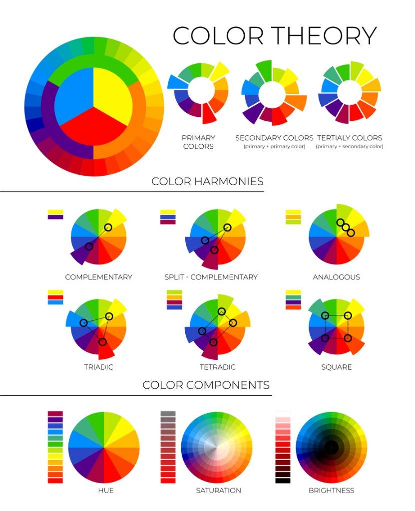
2. Understand Color Theory
Colors not only add spice to our lives but can do the same to your sketch if you know how to use them. The secret to the right color usage is contained in color theory. So, you must understand color theory.
According to the color wheel invented by Sir Issac Newton, colors may be categorized into THREE groups.
- Primary red, blue, yellow.
- Secondary mixes of primary colors
- Tertiary or intermediate - mixes of primary and secondary colors
Now, you need to learn what is hue, value and saturation.
- Hue - It is an attribute that helps distinguish colors into various types - red, blue, green, yellow, etc. Any color on the color wheel is of a different hue.
- Value - The relative lightness or darkness or grayscale is defined by its value. Using the value element, you can create depth, contrast, etc.
- Saturation - The purity or intensity of a color is represented by its saturation. A pure color will be fully saturated in contrast to an impure (desaturated) color.
These are some of the basic concepts related to color theory, which have many other key concepts that you need to learn and master. Other key concepts you will need to learn include warm and cool colors, design harmony, etc.
If you are a NIFT candidate, note that color theory is a part of the NIFT exam syllabus. The NID DAT syllabus may also include questions related to color theory.

Commonly asked questions
Mock tests will include representative questions or questions similar to ones asked in NIFTEE. So, by taking mock tests, candidate will get to know about types of questions asked, marking scheme, weightage, etc. Another important benefit the candidate can draw from solving a sample paper is understanding the question paper layout. For instance, the candidate will know which questions are placed where, the sequence of questions, whether the candidate needs to complete one section before moving to the next, etc.
Color Theory - Primary, Secondary and Tertiary Colors
Learn Perspective Drawing
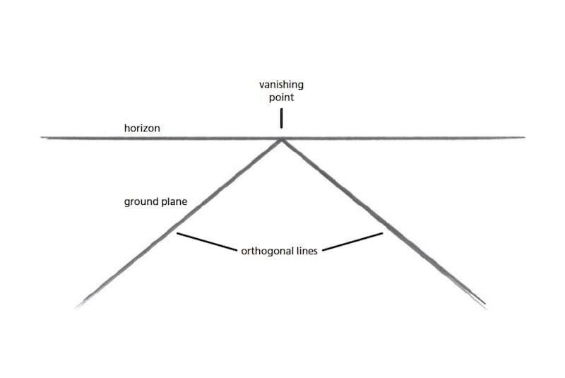
With perspective drawing, you can use a two-dimensional surface to give the illusion of depth and three-dimensional space.
There are various types of perspective drawing.
- One point perspective
- Two point perspective
- Three point perspective
- Multi point perspective
Perspective drawing will have various concepts like horizontal lines, vanishing points, orthogonal lines and foreshortening.

Explore more Design exams with upcoming dates

10 Jun '26 - 14 Jun '26
16 Jun '26 - 18 Jun '26
1 Sep '25 - 30 Jun '26
1 Nov '25 - 30 Jun '26
24 Jun '26 - 1 Jul '26
1 Jul '26
12 Jul '26
1 Nov '25 - 30 Jun '26
How to create perspective drawings?
To create perspective drawing
- Use a horizontal line to determine the viewer’s eye level.
- Depending on perspective type (one point, two point, etc.), you will have to place a vanishing line on the horizontal line.
- Put various elements in the drawing using orthogonal lines. Ensure that these lines converge towards the vanishing points.
- Proceed to add depth and volume using shades, overlapping shapes and line weights.
- To master perspective drawing, practice hard and also make it a habit to observe and analyze how objects around you look.
Note that when drawing, you can express the depth with both linear and atmospheric perspective or by using color. If you use all three, however, you can produce the maximum impact.
Atmospheric or aerial perspective is the expression of depth by changing the values, colors and clarity. For instance, objects in the foreground will have greater value contrast, much more detail, and more intense colors. On the other hand, as we keep increasing the distance, objects will fade away and it will be more difficult to distinguish between them, color difference, etc.
1. Understanding perspective drawing for design exams
If you are appearing for design entrance exams like NIFT, NID DAT, and UCEED, you are expected to know various forms of drawing, including perspective drawing.
For instance, the NIFT 2026 exam syllabus includes a topic on perspective drawing.
So, it is highly recommended that you understand perspective drawing for design exams. Also, practice as much as you can to improve your skills.
2. Learn the Ins and Outs of Drawing Anatomy
The first step in drawing human figures starts with learning the human anatomy.
Here we bring you the dos and don'ts of anatomy drawing.
- While it may look daunting to draw a human form with so many contours, curves, angles, etc., you need to focus on the simple things. For example, start with the structure instead of trying to draw the body contours. To draw the muscle, you can think of sculpted spheres, cylinders, and boxes.
- Again, mistakes also happen because of extensive focus on the muscle. The solution is to think of the muscle as any other part of the human figure.
- If you do need to emphasize muscle, do it to convey emotion, or to show an action, etc. Another thing here is muscle should be the focus of attention, but instead, the action should be.
- Next, while you can use shapes to draw a figure, it is not logical to use the same shape over and over again to draw all types of figures. The trick here is to adopt a shape that fits the subject you are drawing. For instance, if you draw a person with a squarish face, you can use box shapes to draw the person. Likewise, if you are drawing a roundish figure, you may consider spheres.
- Use your knowledge of anatomy and volume to draw human figures. Importantly, don't copy anything you see.
- Make sure you know and follow the proportions - A figure will look attractive, lively, and real if it is in proportion. If you have a good grasp of anatomy, it will come naturally to you, or else you will have to rely on your observation skills. Sometimes, though, artists exaggerate some proportions to convey a certain idea.
3. Try your hands at different materials
The idea is not to limit oneself. Some of the readily available materials may include pencils, paints, pastels, and ink. But these days, artists refuse to be restricted by the medium. That is why you see people making art using charcoal, sand, rice paper, etc.
Even coffee and tea stains, beads, smoke, etc., can be an art material as shown by numerous artists. But, what material you are going to use will depend on how avant-garde you want to be.
Another thing that goes along with the art material is the medium. The digital art medium is, for example, getting popular. If you want to go into the digital path, you should ideally know how to use Adobe Illustrator and Photoshop.
4. Choosing the Right Drawing Materials for Design Exams
If you are appearing in a design entrance exam, you need to choose the right drawing material.
- Pick the right pencil type. Graphite drawing pencils are good, go for 4H, 2H, HB, 2B and 4B.
- A good sharpener
- Eraser
- Drawing paper
Note that as you become used to these materials and learn their handling well, you can use more advanced drawing materials, like oil painting, charcoal, etc.
5. Improve your line drawing
Line art is considered one of the seven main art elements, along with color, shape, value, texture, space and form. So practice line art.
Line art deals with five types of lines - vertical, curved, straight, zig-zag, and diagonal lines.
Using these five lines, you can draw any shape and figure.
6. Light and Shadow Techniques for Design Sketches
Note that light and shadow play a key role in line art.
To give the impression of darkness, you can use thick lines. Line art doesn’t use shaded gradients, which you may have seen in other drawing forms.
Light and Shadow Techniques for Design Sketches
- Take a piece of paper and shade in a value scale from dark to light: You can make rectangular boxes for this exercise. The number of boxes can be up to 10. Now shade the boxes, starting from the darkest, and then keep decreasing the darkness in the remaining boxes, so that the last box has the lightest shade.
- Mark the direction of the light: Depending on the light source - sun, lamp, streetlight. etc. - you need to identify its direction. Once you identify the light source, you can decide the areas having the darkest, lightest, and intermediate light.
- To create a base layer of shading, apply light pressure with the pencil.
- Shade areas where no light can reach with the darkest value.
- Areas closer to the light source will be bright and have very negligible dark values.
7. Learning how to draw Texture Drawing
Texture drawing is the process of adding texture to a sketch or drawing.
And why do you add texture?
The answer is to give impression of depth, dimension and visual stimulation to the drawing.
There are a variety of methods that you can use to add texture to a drawing. For instance, depending on sketch, you may choose to use pencil, charcoal or ink to addtexture. When you are using a particular medium, for example, a pencil, you can use it to create different types of textures. Using a charcoal medium, you can create darker themes. They are suitable for atmospheric themed sketches. Charcoal can create soft, smudged and harsh textures.
Some of the methods of using charcoal involve hatching, cross-hatching, scribbling and stippling. To create soft textures, you can use less pressure and to create hard textures, you can increase the pressure. You can change the pressure to create different textures.

Sayeba Naushad is a commerce postgraduate from Banaras Hindu University. She has over five years of experience in content writing and editing. She has a nose for current events in design field. At Shiksha.com, she s
Read Full Bio