📄
Math Class 11 Notes
Want to quickly cover Math topics?
Revise 11th Math Topics. / Preparation Maths Statistics
A frequency polygon is a graph used for representing the frequencies of different classes in the dataset. It is used to display the shape of the distribution of continous variable. The data is organised into frequency distribution tabke which lists classes or intervals of data and their corresponding frequencies.
For every class, a point is plotted at midpoint of class interval on the x-axis and at frequency of class on the y-axis. This lesson provides a detailed coverage of frequency distribution from the statistics chapter. Students who want to learn more about this topic in detail from exam point of view must check out NCERT solutions of statistics chapter.
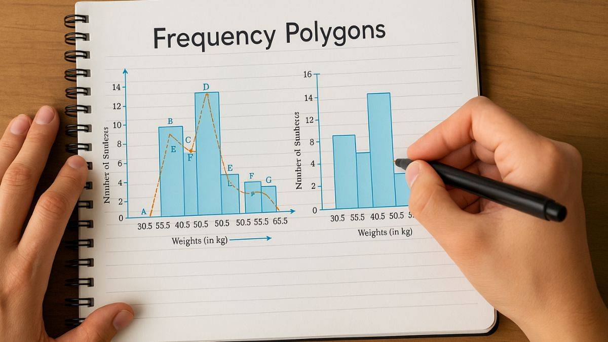
Frequency represents quantitative data. By joining the centre points of a histogram's rectangles, the diagram or figure so formed is known as a frequency polygon. You can observe a slope, which denotes the rate of change (increase/decrease) in the value. Thus, a frequency polygon is a graph constructed by joining the midpoints of each interval. A frequency polygon is the sum of all frequencies.
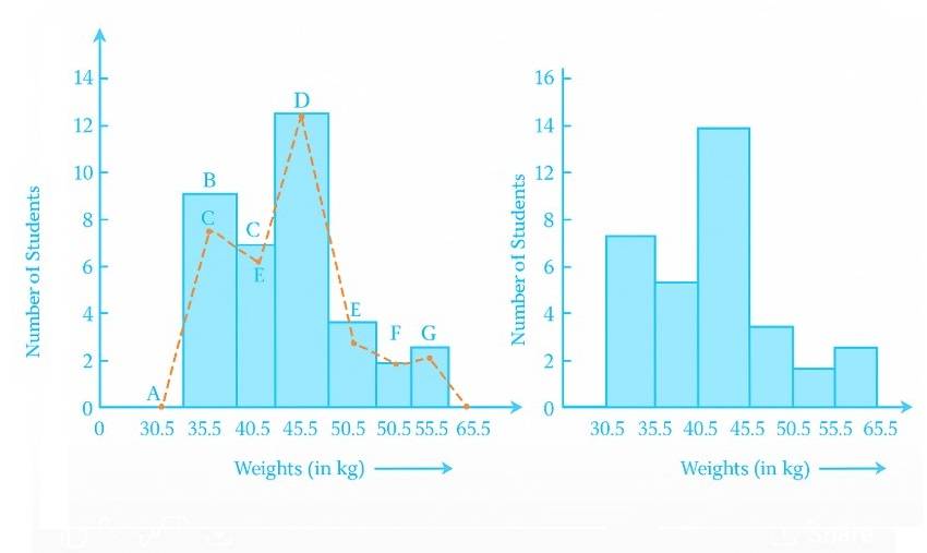
From the above diagram, we can say the area ABCDEFGH is the frequency polygon for the data corresponding to the image's right side.
Math Class 11 Notes
Want to quickly cover Math topics?
Revise 11th Math Topics.Math Class 12 Notes
Math exam syllabus still left?
Complete 12th Math Notes.Chemistry Class 12 Notes
CBSE exams in the near future?
Check out 12th Chemistry Topic.11th Chemistry Notes
Need to stay ahead of other students?
Go Through 11th Chemistry Topics.Frequency polygons have a number of applications that have been explained below:
You need to follow the procedure that has been listed below. IISER exam and GATE exam aspirants must know how to draw a frequency polygon. However, before drawing frequency polygons, you need to construct a histogram:
Step 1: Select a class interval and indicate the values on axis.
Step 2: Label the horizontal axes with the midpoint of each interval.
Step 3: Now, you need to label the vertical axes with class frequency.
Step 4: Mark a point at height in the centre of every class interval as per the frequency of every class interval
Step 5: Use a line segment to join these spots.
Step 6: The representation obtained is the frequency polygon.
Let us consider some examples related to frequency polygons:
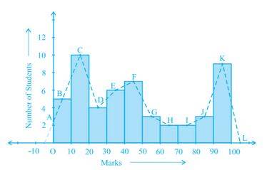
1. Consider the marks, out of 100, obtained by 51 students of a class in a test, given in the table. Draw a frequency polygon corresponding to this frequency distribution table.
| Marks |
Number of students |
|---|---|
| 0-10 |
5 |
| 10-20 |
10 |
| 20-30 |
4 |
| 30-40 |
6 |
| 40-50 |
7 |
| 50-60 |
3 |
| 60-70 |
2 |
| 70-80 |
2 |
| 80-90 |
3 |
| 90-100 |
9 |
| Total |
51 |
Solution.
Let us first draw a histogram for this data and mark the mid-points of the rectangles' tops as B, C, D, E, F, G, H, I, J, K, respectively. The point where this line segment meets the vertical axis is marked as A. Let L be the mid-point of the class succeeding the last class of the given data. The OABCDEFGHIJKL is the frequency polygon, which is shown.
2. In a city, the weekly observations made in a study on the cost of living index are given in the following table. Find the class-marks for all the classes.
| Cost of living index |
Number of weeks |
|---|---|
| 140-150 |
5 |
| 150-160 |
10 |
| 160-170 |
20 |
| 170-180 |
9 |
| 180-190 |
6 |
| 190-200 |
2 |
| Total |
52 |
Solution.
Let us find the class-marks of the classes given above, that is of 140 - 150, 150 - 160,... For 140 - 150, the upper limit = 150, and the lower limit = 140.
So, the class-mark = 150+140/2= 290/2= 145.
Continuing in the same manner, we find the class-marks of the other classes as well.
The table is as follows:
| Classes |
Class-marks |
Frequency |
|---|---|---|
| 140-150 |
145 |
5 |
| 150-160 |
155 |
10 |
| 160-170 |
165 |
20 |
| 170-180 |
175 |
9 |
| 180-190 |
185 |
6 |
| 190-200 |
195 |
2 |
| Total |
52 |
3. Draw a frequency polygon for the data above (without constructing a histogram).
Solution.
We can now draw a frequency polygon by plotting the class-marks along the horizontal axis, the frequencies along the vertical axis, and then plotting and joining the points. So, the resultant frequency polygon will be ABCDEFGH.

Image Source: NCERT
Let us take a look at the frequently asked questions related to frequency polygons:

What are the advantages of frequency polygons?
The following points highlight the importance of frequency polygons:
How many types of frequency polygons are there?
The following are different types of frequency polygons:
How to work out probability from a frequency polygon?
Since a frequency polygon represents the data distribution, by interpreting the areas under curve, it is possible to infer probabilities for some range and interval. Let us take a look at it:
Maths Statistics Exam
Exams accepted
CA Foundation
Exams accepted
ICSI Exam
Exams accepted
BHU UET | GLAET | GD Goenka Test
Bachelor of Business Administration & Bachelor of Law
Exams accepted
CLAT | LSAT India | AIBE
Exams accepted
IPMAT | NMIMS - NPAT | SET
Exams accepted
BHU UET | KUK Entrance Exam | JMI Entrance Exam
Bachelor of Design in Animation (BDes)
Exams accepted
UCEED | NIFT Entrance Exam | NID Entrance Exam
BA LLB (Bachelor of Arts + Bachelor of Laws)
Exams accepted
CLAT | AILET | LSAT India
Bachelor of Journalism & Mass Communication (BJMC)
Exams accepted
LUACMAT | SRMHCAT | GD Goenka Test