📄
Math Class 11 Notes
Want to quickly cover class 11th Math?
Go Through 11th Math Topics. / Preparation Maths Statistics
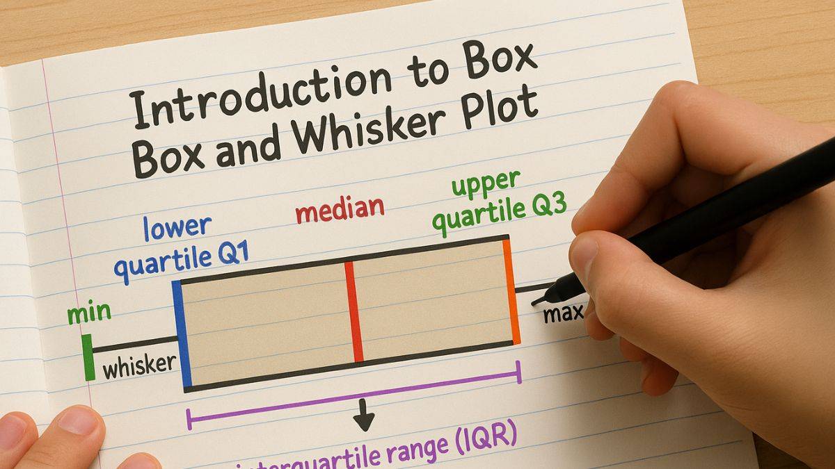
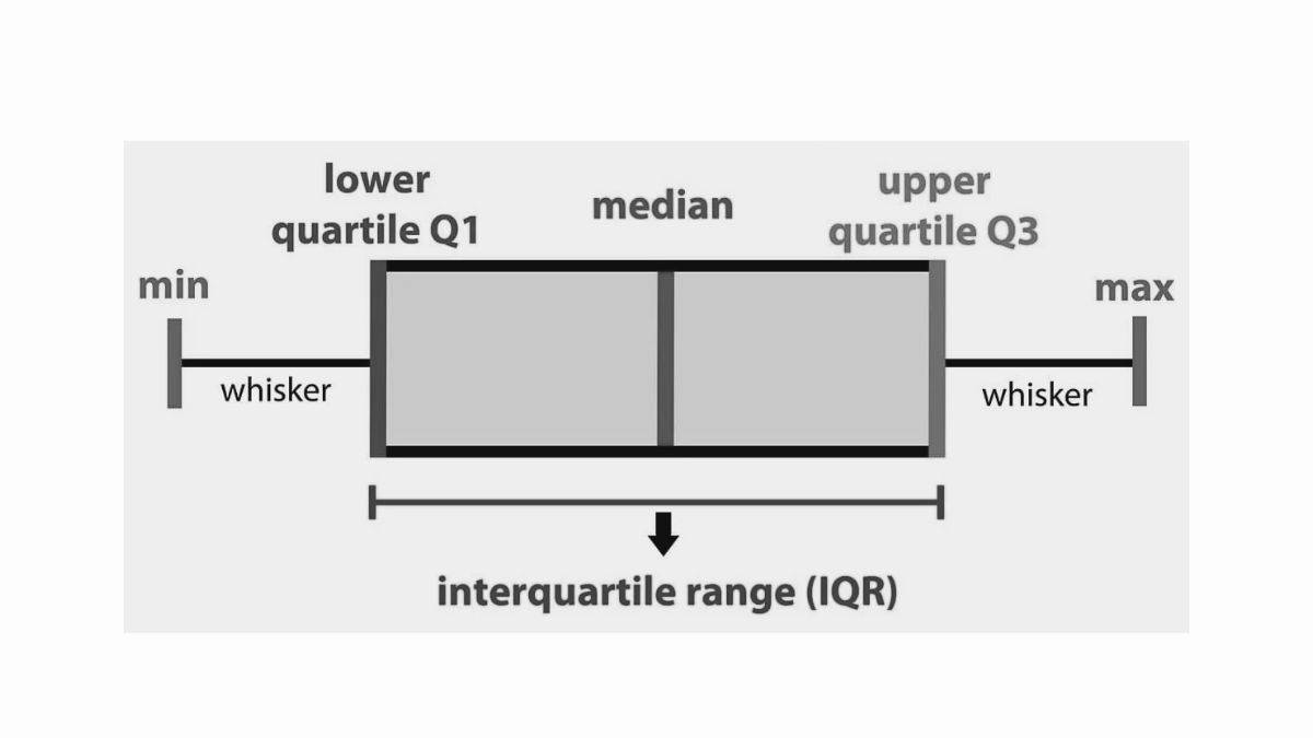
The Box and whisker plot, or box plot, is a graphical representation that displays representation of dataset based on five-number summary. This includes minimum, first quartile (Q1), median, third quartile (Q3) and the maximum.
In statistics, box plot is useful to compare distribution between different datasets or groups since these provide a clear and concise summary of data's key characteristics. For those who want to learn more, they must practice the Statistics solutions of the NCERT book to get a better understanding of how it works.
Box and whisker plots are suitable for contrasting distributions since the core, spread, and total array are immediately identifiable. A box and whisker plot summarises a set of data calculated on an interval scale. This technique is also used for the analysis of explanatory data. IIT JAM exam and CUET exam aspirants must be well aware of the concepts. The box and whisker plot is a graph exhibiting data from the five-numbers set, including central tendency metrics. The distribution is not as precise as the results of a histogram or a stem and leaf plot. The following is a box and whisker diagram:
Math Class 11 Notes
Want to quickly cover class 11th Math?
Go Through 11th Math Topics.Math Class 12 Notes
Worried about Math board exam?
Read 12th Math Notes.Chemistry Class 12 Notes
Need a quick revision before exams?
Revise 12th Chemistry Notes.11th Chemistry Notes
11th chemistry becoming too difficult?
Prepare 11th Chemistry Chapters.Understanding how to build a box and whisker plot is extremely important for aspirants of the NEET exam and the JEE Main entrance exam since the statistics chapter holds good weightage. Let us understand the steps through which you can build a box and whisker plot:
The following points highlight the key uses of box and whisker plots:
Let us understand what is histogram and how it is different from box plot through the following table of comparison between two methods:
| Parameter |
Histogram |
Box Plot |
| Definition |
It is a bar chart that represents the frequency distribution of data |
It is a graphical summary of data through quartiles |
| Purpose |
Shows the distribution and frequency of data within bins |
Summarizes key statistical measures and spread of data |
| Data Representation |
A graph of histogram shows bars to represent the frequency of data points in bins |
For data representation, a box and whisker graph is used to represent quartiles and range |
| Key Elements |
Bins, Frequency |
Minimum, Q1, Median, Q3, Maximum, Outliers |
| Distribution Shape |
It provides a detailed view of the data distribution and modality |
It gives a summarized view of central tendency and spread |
| Outliers |
Not shown clearly |
Clearly shown as individual points outside the whiskers |
| Skewness |
Visually identifiable from the shape of the bars |
Determined by the position of median within the box |
| Use Cases |
To identify overall data distribution and patterns |
To compare distributions, summarize data and identify outliers |
| Sensitivity to Outliers |
Less sensitive |
Extremely sensitive to outliers |
Let us go through some Math questions based on the box and whisker plot:
1. Evaluate the first & third quartiles of the set of data {3, 7, 8, 5, 12, 14, 21, 13, 18).
Solution:
Arrange the data in ascending order: 3, 5, 7, 8, 12, 13, 14, 18, 21
The numbers of terms are 9 i.e., odd in number.
Therefore, Median = 12
The Q1 = median of lower half
= 5+7/2 = 12/2 = 6
The Q3 = median of upper half
= 14+18/2 = 32/2 = 16
So, Q1 and Q3 = 6 and 16
2. Find the interquartile range and range of {7, 3, 8, 12, 21, 5, 14, 18, 15, 13, 14}
Solution:
Arrange the data in ascending order: 3, 5, 7, 8, 12, 14, 14, 15, 18, and 21
Range = Maximum – Minimum = 21-3 = 18.
Q1= 7 and Q3 = = 15.
Therefore, Interquartile Range = Q3 = – Q1 = 15-7 = 8
So, the range =18 and the interquartile range = 8.
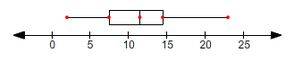
3. Find Q1, Q2, and Q3 = for the given data and also draw a box-and-whisker plot. {2,6,7, 11, 8,8,12,13,14,15,22,23}
Solution:
Total number of observations = 12
The Middle terms are 11 and 12.
Therefore, Median Q2 = 11+12/2 = 23/2 = 11.5
Q1 = Lower halves median i.e. (2, 6, 7, 8, 8, 11) = 7.5
Q3 = Upper halves median i.e. (12, 13, 14, 15, 22, 23) = 14.5
Extremes = Minimum and Maximum values of the data set.
i.e., 2 and 23
Let us go through important questions on Box and whisker plot which are important from both school and entrance exam point of view:

What is the first quartile?
Q1 denotes the first Quartile which is a statistical term to represent value below which 25% of data in dataset falls when arranged in ascending order. Q1 divides dataset into four equal parts which can easily analyze spread and data distribution. It is the median of all the observations of the lower half of the data set. However, it is important to arrange the data in increasing order for accurate results.
What is third Quartile?
Q3 denotes the third Quartile which is the statistical measure to represent value below which 75% of the data falls in dataset when arranged in ascending order. It is the median of all the observations of the upper half of the data set i.e. 25% of the data. It is commonly used in conjunction with Q1 and median to provide the summary of distribution of dataset.Before calculating the result, it is important to arrange the data in increasing order.
What is a range in statistical dispersion?
What is the Interquartile range?
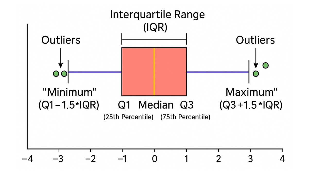
The Interquartile range is also a measure of statistical dispersion that indicates the range within which middle 50% of dataset remains. It is the difference between the third and first quartile of the given dataset. Also known as IQR, it represents the length of the box which illustrates the spread of middle 50% data. All those data points that are either below Q1 - 1.5 x IQR or above Q3 + 1.5 x IQR are considered as outliers.
Maths Statistics Exam
Exams accepted
CA Foundation
Exams accepted
ICSI Exam
Exams accepted
BHU UET | GLAET | GD Goenka Test
Bachelor of Business Administration & Bachelor of Law
Exams accepted
CLAT | LSAT India | AIBE
Exams accepted
IPMAT | NMIMS - NPAT | SET
Exams accepted
BHU UET | KUK Entrance Exam | JMI Entrance Exam
Bachelor of Design in Animation (BDes)
Exams accepted
UCEED | NIFT Entrance Exam | NID Entrance Exam
BA LLB (Bachelor of Arts + Bachelor of Laws)
Exams accepted
CLAT | AILET | LSAT India
Bachelor of Journalism & Mass Communication (BJMC)
Exams accepted
LUACMAT | SRMHCAT | GD Goenka Test