📄
Class 11 Math Notes
Take a quick glance at important concepts
Read Class 11th Math Notes. / Preparation Maths Statistics
A graphical representation is a way of visually representing information so that anyone can easily understand the provided details. Through this type of representation, people can easily correlate different factors and understand the data in a meaningful way. The CBSE board has covered this topic in the statistics chapter. Furthermore, for the convenience of students, we have included NCERT solutions for the statistics chapter. Students can refer to these solutions for a better understanding of the best way to solve questions related to graphical representation.
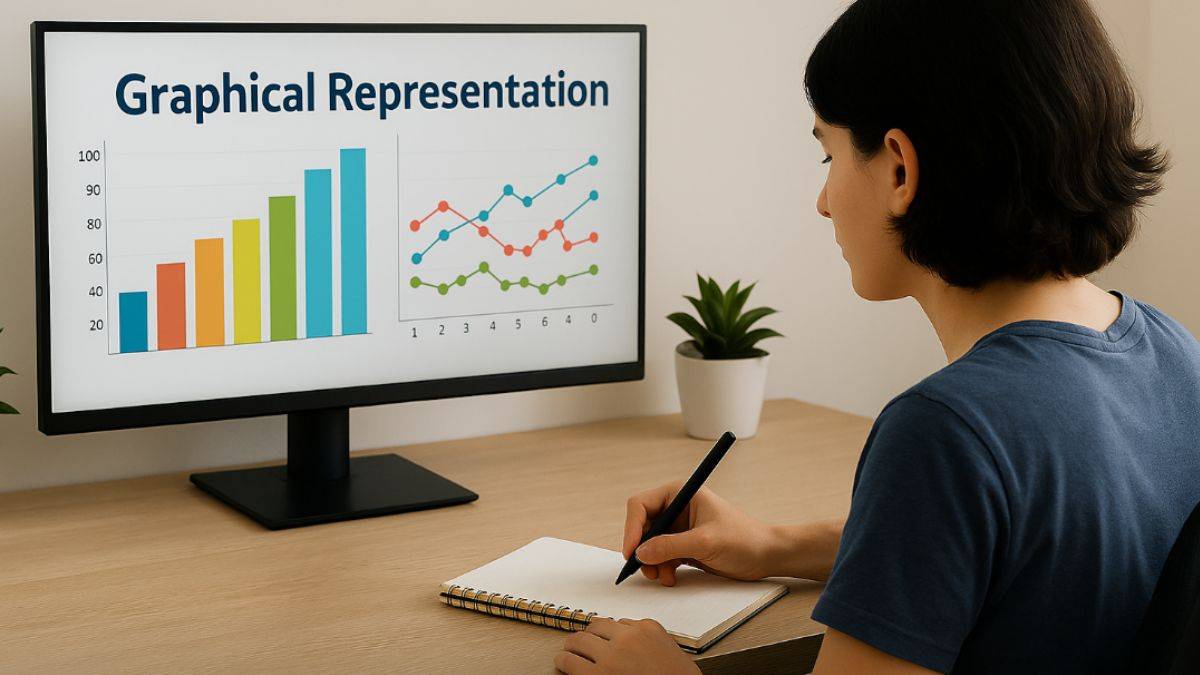
Through this lesson, students will learn about the various types of graphical representations and their use cases. Let us get started.
Take a quick glance at important concepts
Read Class 11th Math Notes.CBSE boards worrying you?
Prepare Class 12 Math TopicsBe prepared way before exams!
Revise NCERT NotesAll subjects will be prepared well before time!
Revise NCERT 12th SubjectsGraphical representations present information in visual form so that it can appear like meaningful data, and people can easily understand it. This includes illustrating how the data, concepts, information, and principles connect. It is easy to grasp and is one of the easiest ways to gain knowledge. There are different types of graphical representations that we will be discussing in the next section. NEET and CUET often ask questions that require presenting data in a graphical way. Therefore, it is important to understand all methods in a detailed manner. Let us first list the different forms briefly. The following is a list of different types of graphical representations:
This concept is taught in the chapter ‘Statistics.’ This chapter carries 5 marks.
Graphical representation visually displays information, making it easier to understand complex datasets and relationships. Here are some common types of graphical representations:
1. Bar Chart: This represents data in the form of rectangular bars, where the length of each bar is proportional to the value it represents. It is often used for comparing different categories.
2. Line Graph: It visually represents information as series of data points that are connected by straight line segments. Most people use it to show trends over time.
3. Pie Chart: This is a circular chart that is divided into pie-like sectors that represent a part of the complete circle. It is useful for showing the distribution in different pies.
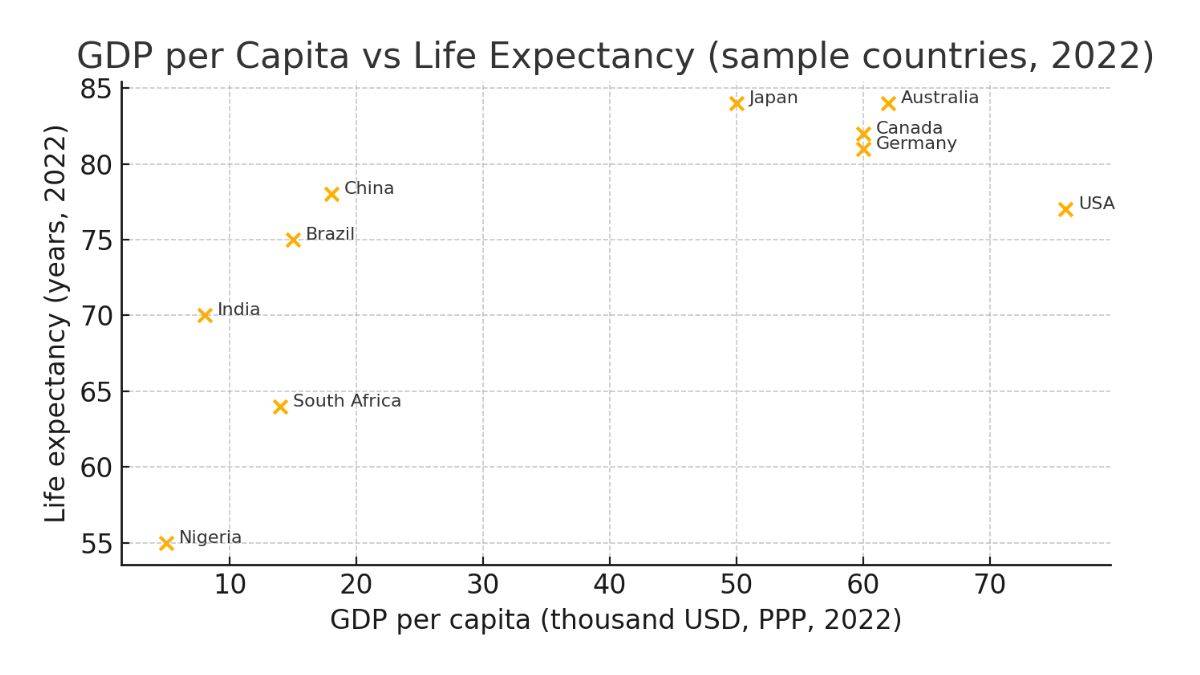
4. Scatter Plot: It uses dots for representing values of two different numeric variables. This graphical representation is used to represnt the relationship or correlation between two variables.
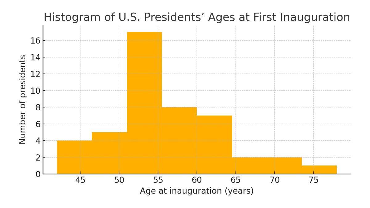
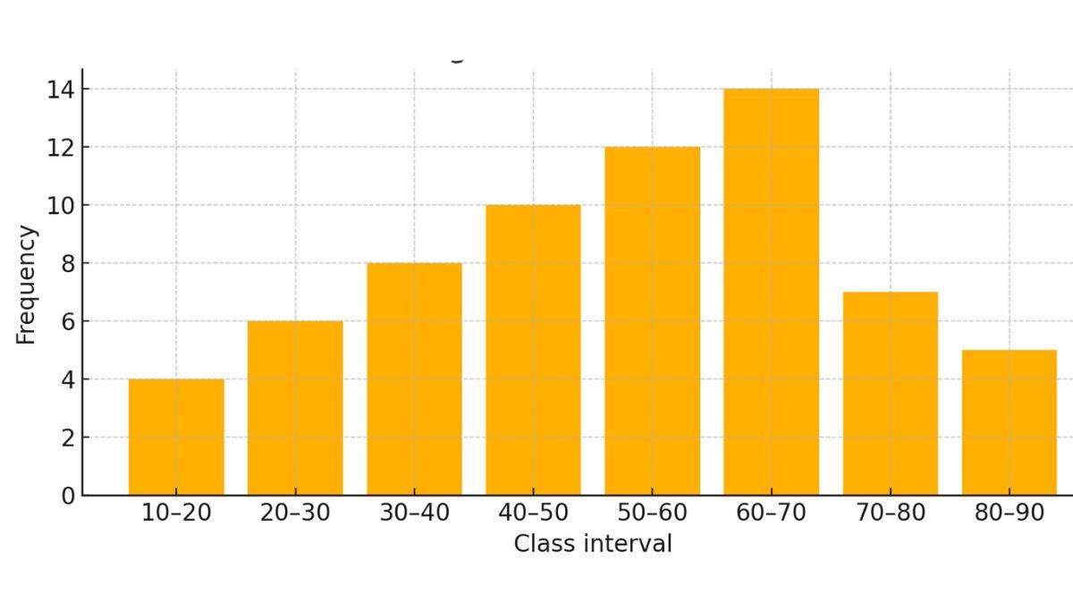
5. Histogram: It looks like a bar chart, but it is used to represent the distribution of numerical data by grouping data points into ranges.
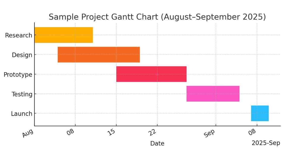
6. Gantt Chart: This is a bar chart that is used for illustrating the schedule of a project, which shows the beginning and end dates of elements of a project.
Data may be displayed readily by different types of graphical representations, but they must obey the following rules:
All in all, the aim of graphical representation is to present data in a logical, organised and clear manner. This approach will turn the information into meaningful and valuable data. Many exams, such as JEE Main and IIT JAM have a data interpretation section which requires the aspirant to know graphical representation.
Q: What are the different graphical representations of data?
Q: For what benefits is the graphical method useful?
Q: What is graphical representation?
Q: What is diagrammatic representation?
Q: What are some of the major types of charts?
1. Draw a histogram of the following data.
| Class Interval |
10-20 |
20-30 |
30-40 |
40-50 |
50-60 |
60-70 |
70-80 |
80-90 |
| Frequency |
4 |
6 |
8 |
10 |
12 |
14 |
7 |
5 |
Solution.
Label the class interval along the X-axis, and the frequency across the Y-axis.
Assume the class interval 0-10 with zero occurrences and class interval 90-100 with zero occurrences.
Now, evaluate the middle of the class interval.
| Class intervals |
Midpoints |
Frequency |
| 0-10 |
5 |
0 |
| 10-20 |
15 |
4 |
| 20-30 |
25 |
6 |
| 30-40 |
35 |
8 |
| 40-50 |
45 |
10 |
| 50-60 |
55 |
12 |
| 60-70 |
65 |
14 |
| 70-80 |
75 |
7 |
| 80-90 |
85 |
5 |
| 90-100 |
95 |
0 |
Maths Statistics Exam
Exams accepted
CA Foundation
Exams accepted
ICSI Exam
Exams accepted
BHU UET | GLAET | GD Goenka Test
Bachelor of Business Administration & Bachelor of Law
Exams accepted
CLAT | LSAT India | AIBE
Exams accepted
IPMAT | NMIMS - NPAT | SET
Exams accepted
BHU UET | KUK Entrance Exam | JMI Entrance Exam
Bachelor of Design in Animation (BDes)
Exams accepted
UCEED | NIFT Entrance Exam | NID Entrance Exam
BA LLB (Bachelor of Arts + Bachelor of Laws)
Exams accepted
CLAT | AILET | LSAT India
Bachelor of Journalism & Mass Communication (BJMC)
Exams accepted
LUACMAT | SRMHCAT | GD Goenka Test